Don’t blame it on the rain. Blame it on Tesla and Volvo, the pioneers of the tablet-style infotainment screen. They literally flipped the infotainment script on what customers expected from their systems with display graphics that were cleaner and truly different in the vast sea of colored buttons and song names cut off on the display.
In the years since, many automakers have followed suite, most notably with Ram’s 12.3-inch and Ford’s 10.1-inch vertical displays. Nissan, like Hyundai, will be bucking the trend.
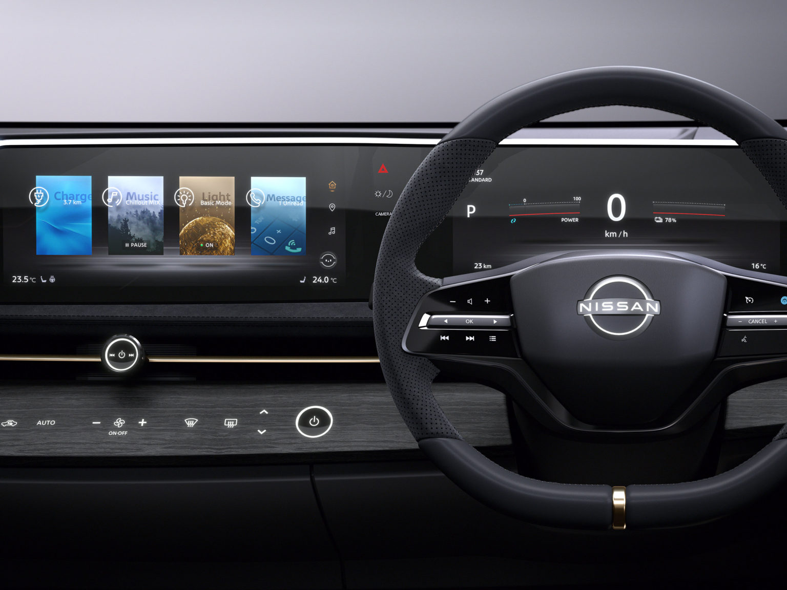
The interior off the model shows off its roominess with horizontal space showcased by long design lines across the dashboard.
Photo courtesy of Nissan North America
When developing its display for the Ariya Concept, Nissan prioritized design and vision over the tablet trend. Instead, the design team created a curved two-screen display that was made to look wave-like and give a sense of horizontal proportion.
The layout reflects Nissan’s new Timeless Japanese Futurism design language, also expressed in the Ariya Concept’s unique shield (instead of a grille). This look is something that Mercedes-Benz has begun to embrace, and Cadillac has executed in the new Escalade.
“The human eye naturally looks from side to side when driving,” explains Tomomichi Uekuri, senior manager of HMI engineering team. “People can see and absorb more information if it’s laid out horizontally. Peripheral vision works this way as well.”
According to the automaker, “In addition to conveying information better for the human eye, the layout does so from a safer location — in the line of sight, closer to the road. By matching the cabin’s horizon aesthetic, it becomes a seamless part of the dashboard. Nissan’s design team calls this “engawa” – the undefined space between where you are, and where you are going.”
The Nissan Ariya Concept’s display combines the information traditionally found on a driver’s information display and infotainment screen and masks them under one display. Information can be changed out and moved by swiping.
“The display’s wave construction is innovative and utilizes an ergonomic layout for both the meter display and the center display, not only for visibility, but also allows the driver to easily reach the center display touch screen,” Uekuri explains.
It looks great, but how close is that to reality? The Ariya Concept, while futuristic, serves as a showcase of the possible. It’s interlay in the realm of possibility that the design language of the model carries over into the next Rogue or Murano. It could go into Nissan’s new all-electric SUV.

