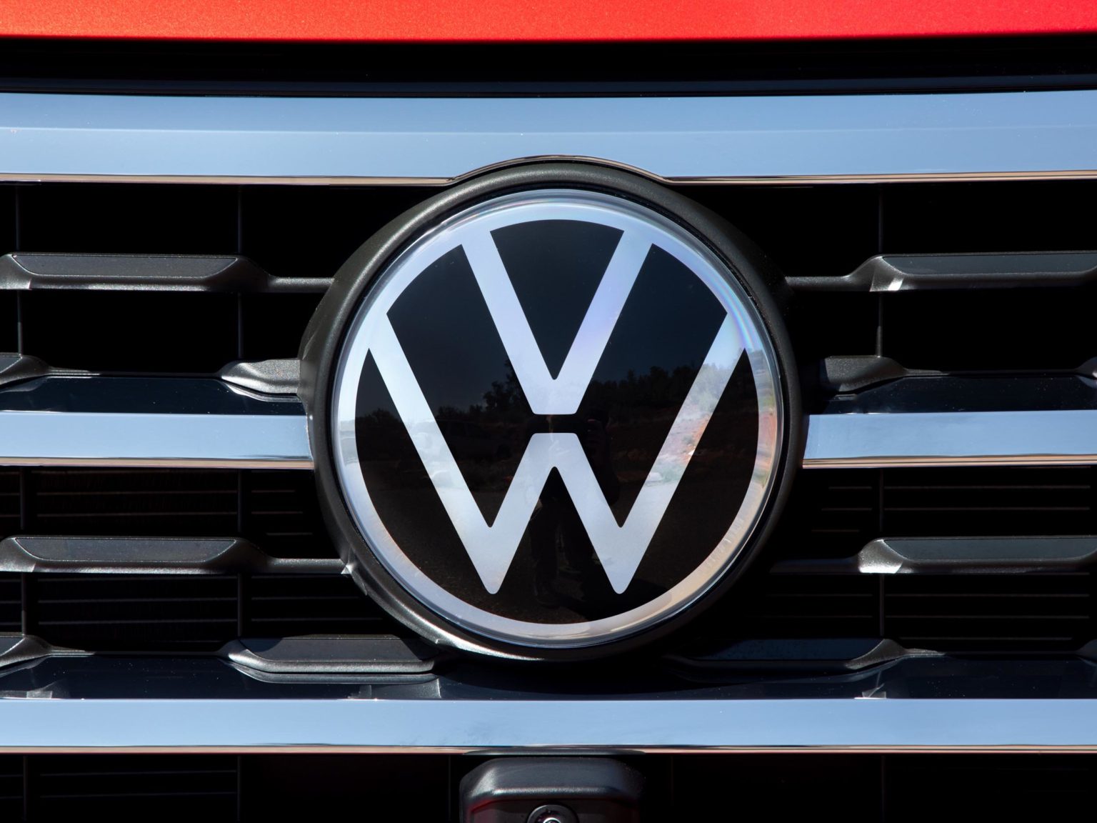
Earlier this year, Volkswagen announced that it was rebranding with a fresh logo that mixes together a touch of heritage with a dash of modernism. The successful formula was well-received, unlike BMW’s rebranding efforts.
Volkswagen describes the new logo as, “a refreshed, minimalist take on the classic logo, allowing for more flexibility and versatility when it comes to the signature symbol. It’s a modern and simpler version of the previous logo, which has identified the brand for over 70 years.”
Here, Volkswagen shows the major changes to the logo.Photo courtesy of Volkswagen AG
Like the BMW logo, the new VW design was meant to lead on digital first as the automaker works to move in tandem with the speed of innovation. For that reason, the new logo is flat and two-dimensional in appearance.
The redesign was led by Volkswagen Chief Designer Klaus Bischoff, who said, “My personal drive in this redesign was to make the W float, bringing a new lightness to the Volkswagen brand. Of course, this rebrand also brings Volkswagen into the digital era, transforming our classic logo into a trademark that is easily displayed digitally on devices and applications.”
Along with the new logo, a new brand color scheme has been adopted. The bright blue colors of the past have been shifted to a more sophisticated deep blue done.
In 2019, 6.2 million vehicles were built with the old “VW” on their grilles and sales of those vehicles are beginning to wrap up. The new logo is now making its way to U.S. shores, with the first vehicle slated to receive it, the Volkswagen Atlas Cross Sport, arriving at dealerships.
The Atlas Cross is also home to VW’s new “R” badging.
By mid-2020, the brand plans to complete the rollout of the rebrand across the 10,000 dealers in 171 markets spanning 154 countries.

