Rolls-Royce has been through many iterations in its storied history. One-half of the founding duo, Charles Rolls, was a pioneer, pushing the limits of extreme transportation solutions at the turn of the 20th Century. After his untimely demise, it was his business partner Henry Royce that continued to push the automaker forward with designs that revolutionized the way the world’s well-to-do traveled.
Now, Rolls-Royce is on the cusp of a new design era – one that brings cutting edge technology and design to models perhaps too frequently viewed as for stodgy men of means. The company will launch the new Rolls-Royce Ghost in the coming days.
Rolls-Royce will launch a new generation of the Ghost in September.Photo courtesy of Rolls-Royce Motor Cars
Ahead of that unveiling, Rolls-Royce is shedding its old brand identity for an updated version meant to attract younger buyers. For years now, Black Badge models have attracted owners far under 50 years old – the age of the marque’s clients has decreased significantly to an average of just 43.
The new visual language is designed to appeal to those younger buyers while keeping sophistication in focus while exuding the contemporary design language Rolls-Royce is evolving to include.
“As the marque’s digital presence increases, there has never been a more important time for the visual language of the company to reflect our standing as the leading luxury brand in the world,” said Torsten Müller-Ötvös, Chief Executive, Rolls-Royce. “We have embarked on a fascinating journey of modernizing our brand identity to echo those changes seen in our portfolio, our client demographic, their lifestyle and the luxury world that surrounds them.”
Fresh Rolls-Royce typography has its roots in a font used by the company in the 1930s.Photo courtesy of Rolls-Royce Motor Cars
Rolls-Royce’s parent company, BMW, recently showed off its new brand identity to mixed reaction.
Marina Willer, partner at Pentagram, was tasked with heading up efforts to craft the new identity. “What soon became apparent is that Rolls-Royce has evolved from being regarded as an automotive manufacturer into a leading light in the world of luxury,” said Willer, “It was essential for us to ensure that the brand’s new identity reflected this shift. We needed to present Rolls-Royce in a forward-facing, fresh and relevant way – speaking to new audiences while respecting the company’s loyal clients.”
The new identity took a focused look on many of the hallmark elements that are associated with the marque.
The Spirit of Ecstasy
Photo courtesy of Rolls-Royce Motor Cars
The Spirit of Ecstasy
Photo courtesy of Rolls-Royce Motor Cars
The Spirit of Ecstasy
Photo courtesy of Rolls-Royce Motor Cars
The Spirit of Ecstasy
Photo courtesy of Rolls-Royce Motor Cars
The Spirit of Ecstasy
Photo courtesy of Rolls-Royce Motor Cars
Photo courtesy of Rolls-Royce Motor Cars
The Spirit of Ecstasy sits at the front of every Rolls-Royce. She is an instantly recognizable aspect of the brand with history dating back to 1911. The glamorous icon will still grace the hood of models, unchanged. However, how the Spirit is depicted in print and digital is changing.
The original figurine was drawn and sculpted by British artist Charles Sykes. Chris Mitchell, an illustrator of brand and identity icons, was hired by Pentagram to create a distilled form of the Spirit. When depicted in two-dimensional form, Mitchell changed the Spirit’s direction from left to right to signify the brand boldly facing the future.
Colors
Black and platinum are traditional Rolls-Royce colors. A new modern era at the company required a fresh color palette. Initially, Pentagram’s design team turned its attention to the company’s product line, drawing inspiration from the rich textures, wooden brown hues, leathers, and graphite technical fibers.
This move wasn’t far enough for the company who pushed Pentagram to move beyond the confines of tradition, seeking a more expressive palette that appealed to men and women equally.
Photo courtesy of Rolls-Royce Motor Cars
Photo courtesy of Rolls-Royce Motor Cars
Photo courtesy of Rolls-Royce Motor Cars
Photo courtesy of Rolls-Royce Motor Cars
Photo courtesy of Rolls-Royce Motor Cars
Purple tones are rare in nature. The color has its roots in mythology, art, piety and royalty, having been viewed as a color of power and wealth for centuries. Pentagram chose to name the purple hue chosen as the company’s new signature color Purple Spirit, giving a nod to the Spirit of Ecstasy and Rolls-Royce history.
Rose Gold was chosen to compliment this color. The hue will be reserved for items of longevity and used only in printed form. Additional complementary colors have been chosen for digital expression.
“Purple Spirit has a deep and powerful tone. It is a color of modernity that evokes connotations of the dark and majestic night,” said Sami Coultas, Bespoke Color and Trim designer, Rolls-Royce. “It has an energy that conjures emotion with thoughts of strength and ambition – a tone well suited to inspiring greatness. This will be complemented by a foiled Rose Gold which will add elegance and grace to the marque’s printed materials.”
Badge of Honor/Wordmark/ Monogram
Photo courtesy of Rolls-Royce Motor Cars
Badge of Honor/Wordmark/ Monogram
Photo courtesy of Rolls-Royce Motor Cars
Badge of Honor/Wordmark/ Monogram
Photo courtesy of Rolls-Royce Motor Cars
Badge of Honor/Wordmark/ Monogram
Photo courtesy of Rolls-Royce Motor Cars
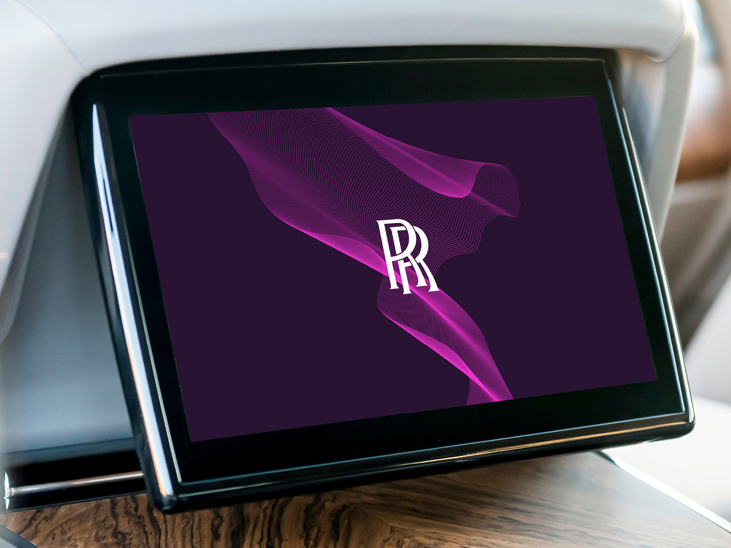
Rolls-Royce will continue to use the double “R” Badge of Honor on the marque’s products – reserved solely for the creations born at the Home of Rolls-Royce in Goodwood, West Sussex. The monogram retains its original form but replaces the Badge of Honor on collateral. The Wordmark ‘Rolls-Royce Motor Cars’, as found presiding above the door of the marque’s establishments, was found to be corporate and unrepresentative of the marque’s standing as a House of Luxury.
During its work for Rolls-Royce, Pentagram uncovered typography in the marque’s archives from the 1930’s that featured an art-deco style that served as the basis for the new Wordmark.
According to a release, “The words ‘Motor Cars’ have reduced in size, with the emphasis reverting to Rolls-Royce, in recognition of the marque’s significantly wider influence outside of the automotive industry. The Wordmark has become more refined in its appearance, depicting the quiet, whispering power of contemporary Rolls-Royce. Special significance has been paid to the letter ‘R’, to provide additional stability and prominence to this important character in the Rolls-Royce script.”
Photo courtesy of Rolls-Royce Motor Cars
Black Badge
Photo courtesy of Rolls-Royce Motor Cars
Typeface
The font chosen to represent the brand is Riviera Nights. It comes from the same family as Gil Sans Alt, the marque’s previous font, but with additionally crafted and bevelled letters. That typeface carries over to Black Badge badging as well.

